Neurogenesis Styler – Complete Design Controls for the Block Editor
by mentholinc on WordPress.org
Complete design controls for every block - responsive styles, hover effects, shadows, transforms, and more. No CSS. No new blocks. No lock-in.
Typography controls in the block sidebar - customize fonts, sizes, line height, spacing, and text shadows.
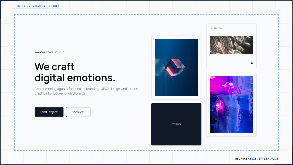
Neurogenesis Styler adds the design controls the Block Editor is missing – without replacing your blocks, adding bloat, or locking you into a proprietary system. Install it, style your blocks visually, and keep your existing content exactly as it is.
Every control is visual. No CSS knowledge required.
Responsive Styles – Desktop, Tablet, and Mobile
Set different values for every styling property at each breakpoint. Typography, spacing, sizing, visibility, and text alignment all respond independently per device. Controls also support theme.json variables – pick from your theme’s declared color, spacing, and typography values directly inside the panel, keeping your design system consistent.
Typography
Font family, weight, size, line height, letter spacing, and text shadow – all responsive. Font sizes support fluid scaling using CSS clamp(), so your typography transitions smoothly across screen sizes without jumping between fixed values.
Backgrounds
Colors, gradients, and images – with Background Clip control for creative text and element effects. Multi-layer backgrounds coming in the next version.
Borders
Width, style, and color – set globally or per side independently. Border radius with full corner control.
Spacing
Margin and padding per side, per breakpoint. Supports theme.json spacing scale values for consistency with your theme.
Block Sizing
Width, height, minimum and maximum dimensions – all responsive. Keep elements at the right size on every screen without writing a single media query.
Visual Effects
Box shadow, text shadow, opacity, z-index, and transitions – all with visual controls. Hover states available for colors, backgrounds, borders, and shadows, letting you build micro-interactions directly in the editor.
Transforms and Positioning
Rotate, scale, skew, and translate with visual sliders. CSS positioning – relative, absolute, and sticky – with offset controls. No need to touch Additional CSS.
Custom Element Selectors
Style specific elements inside a block – not just the block wrapper itself. Define a CSS path to target repeating sub-elements like images inside a gallery, text inside columns, or links inside a card. Useful anywhere the block’s own controls don’t reach.
Full Site Editing
Works inside the Site Editor. Style template parts, global patterns, and page templates with the same controls available in the post editor.
No New Blocks. No Lock-in.
Neurogenesis Styler extends the native blocks you already use. It does not register new blocks or replace core ones. Deactivate the plugin and your content remains intact – your blocks render normally without any leftover markup or broken layouts.
Source Code
This plugin uses JavaScript and SCSS, which are compiled into the production-ready files in the /assets/dist/ directory.
The original, human-readable source code is included in the /assets/js directory.
The build configuration for this plugin is included in package.json.txt. Rename it to package.json before npm install. Developers can review, modify, or extend the code from there.
Build Instructions
- Make sure you have Node.js and npm installed.
-
From the plugin root, install dependencies:
npm install
-
To build the production assets:
npm run build
-
For development with automatic rebuilds on file changes:
npm run start