MOBILOOK - Settings Page
In an era where mobile usage dominates internet traffic, it is crucial to have a mobile-friendly website. Ensuring your website meets mobile-friendly criteria is a key factor in online success, both for users and search engines.
What You Should Know:
- Mobile web traffic currently represents 60.67% of global internet traffic, while desktop traffic accounts for 39.33% (StatCounter, 2024) (DataReportal – Global Digital Insights).
- Mobile searches constitute over 60% of all Google searches (Google, 2024) (DemandSage).
- The use of mobile devices to access the internet continues to grow, with over 92% of internet users preferring to use a mobile phone for browsing (DataReportal, 2024) (DemandSage).
- In 2024, there are more than 5.3 billion mobile internet users worldwide, and this number is expected to reach 5.8 billion by 2026 (DemandSage, 2024) (DemandSage).
Overview:
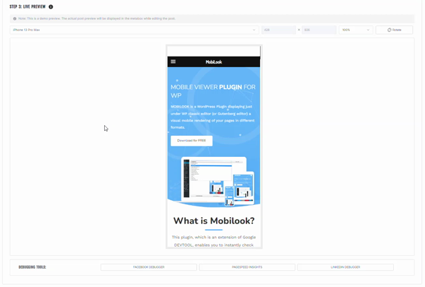
The MOBILOOK (Mobile View) plugin, an extension of Google DEVTOOL, allows you to instantly check the responsive design of your pages, articles, or products on mobile in various formats (Apple, Samsung, Google devices).
Once installed, MOBILOOK (Mobile View) is deployed on each of your pages. A section appears just below the WordPress Content Editor; once your content is published, it immediately shows you the mobile rendering based on the format you have defined.
There’s no longer a need to check what your site looks like on your mobile to see if it’s well suited to phones, tablets, and other media (responsive).
PRO Features
MOBILOOK PRO (Mobile View) offers several features:
- Activation of the plugin for all custom post types, including WooCommerce products, to instantly see if the product page design is responsive.
- Activation of additional formats – The PRO version gives you access to a large list of mobile/tablet formats (17).
- Activation of three very useful features:
- Facebook Debugger allows your pages to be crawled by Facebook’s bots to generate up-to-date OpenGraphs.
- Pagespeed.dev analyzes your page to identify if it meets all efficiency criteria.
- Mobile SEO (site zoom on mobile) – This feature adds an optimized viewport meta tag on all your pages, allowing users to zoom with mobile browsers.
Available Device Formats (Mobile View)
- (FREE) iPhone 13 Pro Max – 428 x 926
- (FREE) Samsung Galaxy S22 Ultra – 308 x 720
- (FREE) Google Pixel 6 Pro – 412 x 915
- (PRO) iPhone 12 – 390 x 844
- (PRO) Google Pixel 5 – 393 x 851
- (PRO) OnePlus 9 Pro – 321 x 711
- (PRO) Samsung Galaxy Note 20 Ultra – 308 x 720
- (PRO) iPhone 11 – 414 x 896
- (PRO) Samsung Galaxy S21 – 320 x 720
- (PRO) Xiaomi Mi 11 – 320 x 720
- (PRO) Huawei P40 Pro – 264 x 1200
- (PRO) iPad Air (2022) – 820 x 1180
- (PRO) iPad Pro 12.9 inches (2021) – 1024 x 1366
- (PRO) Samsung Galaxy Tab S8 Ultra – 1848 x 2960
- (PRO) Microsoft Surface Pro 8 – 1368 x 912
- (PRO) iPad Mini (2021) – 744 x 1133
Why Is a Responsive Site Important for SEO?
Since April 2015, Google has officially rewarded mobile-friendly websites and penalized sites that are not mobile-friendly in its search rankings. A non-mobile-friendly site risks seeing its traffic drop significantly due to a decrease in its SEO ranking.
A responsive web design ensures that your site functions properly on all devices and screen sizes, offering an intuitive and satisfying user experience.
Explanation of the Tools:
- LinkedIn Post Inspector: This tool allows your pages to be crawled by LinkedIn bots to generate up-to-date OpenGraphs. When you share a link on LinkedIn, LinkedIn bots fetch images and other content information to generate a correct preview. This tool ensures that your content is correctly displayed with appropriate metadata, enhancing the visibility and appearance of your posts on LinkedIn.
- Pagespeed.dev: This tool analyzes your page to identify if it meets all of Google’s efficiency criteria. Unlike Google DEVTOOL, Pagespeed.dev provides insights into how Googlebot (Google’s spider) views your page, which is crucial for SEO. If your site passes the test, it means it is optimized for a mobile experience, which can improve its ranking in Google’s search results.
What Is a Responsive Site?
Responsive web design is the practice of building websites that work properly on every device and screen size, whether large or small, mobile or desktop. Responsive design focuses on providing intuitive and gratifying experiences for everyone. Google has increasingly pushed to ensure all websites are mobile-friendly because mobile searches have consistently risen since 2009 and finally surpassed desktop searches in 2018.