Responsive Navigation Block
by David Smith on WordPress.org
Complete control over your navigation menus based on screen size including styles and menu items.
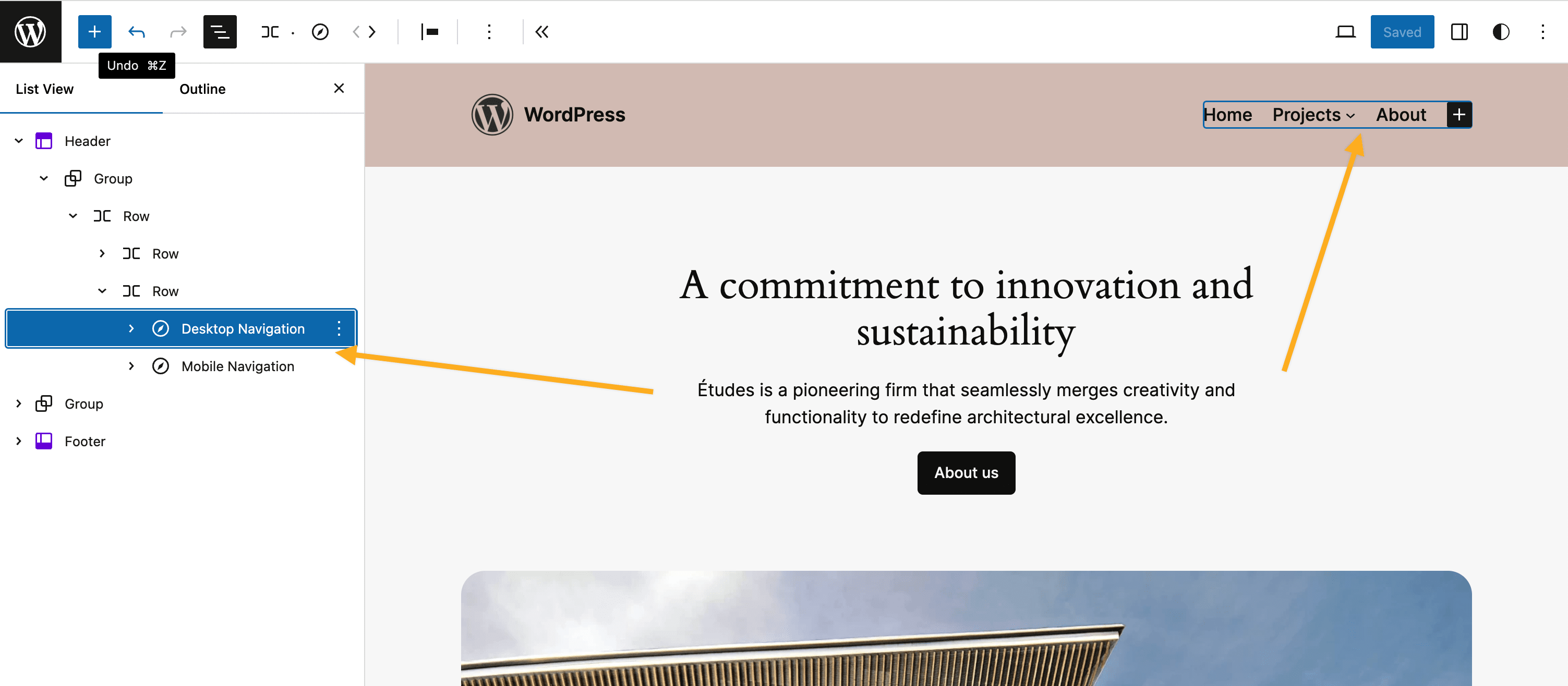
This Plugin allows you to display and apply alternative styling to different navigation menus based on the screen size using the WordPress Navigation block.
Video Walkthrough
Features
- Two new Navigation Block (variations) for:
- Mobile
- Desktop
- Style your menu differently depending on screen size.
- Use a different menu for each screen size.
- Customize the “breakpoint” (where you switch between mobile and desktop).
- Automatically switch editor to “mobile” preview when editing the mobile navigation.
Usage
This Plugin creates two block variations from the Navigation block which will be automatically hidden/shown at the configured screensize (breakpoint):
- Navigation (Mobile) – will be displayed only on smaller screen sizes.
- Navigation (Desktop) – will be displayed only on larger screen sizes.
This affords the ability to independently style mobile vs desktop navigation and even allows for completely different menus to be used.
The Plugin should be used as follows:
- Install and Activate the plugin – two new block variations will be automatically registered for “Mobile” and “Desktop”.
- Go to the Editor and remove any existing Navigation block.
- Add the “Desktop Navigation” block – style and configure the menu for “desktop” as required.
- Add the “Mobile Navigation” block – style and configure the menu for “mobile” as required.
- View the front of your website and resize your browser to see the navigations swap out at the appropriate breakpoint/screensize.
Alternatively you can transform the default Navigation block to either Mobile or Desktop variations via the block’s interface.
Support
Please see FAQs. If you still have an issue please:
- check Github for existing Issue reports.
- (if none) then file a new Issue on Github
Privacy Statement
Responsive Navigation does not:
- use cookies.
- send data to any third party.
- include any third party resources.
Contributing
Contributions to this Plugin are welcome. Please fork the Github repository and submit a PR for review.
Development Setup
This Plugin uses the @wordpress/scripts package.
- Check out the Github repo into the
wp-content/pluginsdirectory of a WordPress installation. cdinto the Plugin’s directory install the dependencies withnpm i.- Running
npm startwill start the@wordpress/scriptspackage in watch mode ready to compile the JavaScript on modification. - PHP files can be edited in the usual manner.
Testing
The Plugin has e2e test coverage for the key features courtesey of @wordpress/scripts and Playwright.
To run the tests – in your terminal of choice:
npm run build.npm run wp-env start.- Run the tests:
npm run test:e2e
Releasing
Releasing the Plugin to the WordPress.org Plugin repo is the prerogative of the Plugin owner (@get_dave). The process is as follows:
Test the Plugin
- Commit all changes to
trunkbranch. - Push changes to
trunk(only) –git push origin trunk. - In Github:
- Actions
- Select the
Build Release Zipaction. - Select the
Run workflowdropdown and run the workflow to generate a zip file. - When action completes download the generated Plugin zip artifact.
- Manually install and test the .zip.
Deploy to WP.org
- When ready to deploy.
- Bump Plugin version and tag release –
npm run bump-version. - Push trunk and tags –
git push origin trunk --tags - Deployment to WP.org will be handled automatically.