Fluid Font Forge
by Jim Roberts on WordPress.org
Advanced fluid typography calculator with CSS clamp() generation for responsive font scaling across all device sizes.
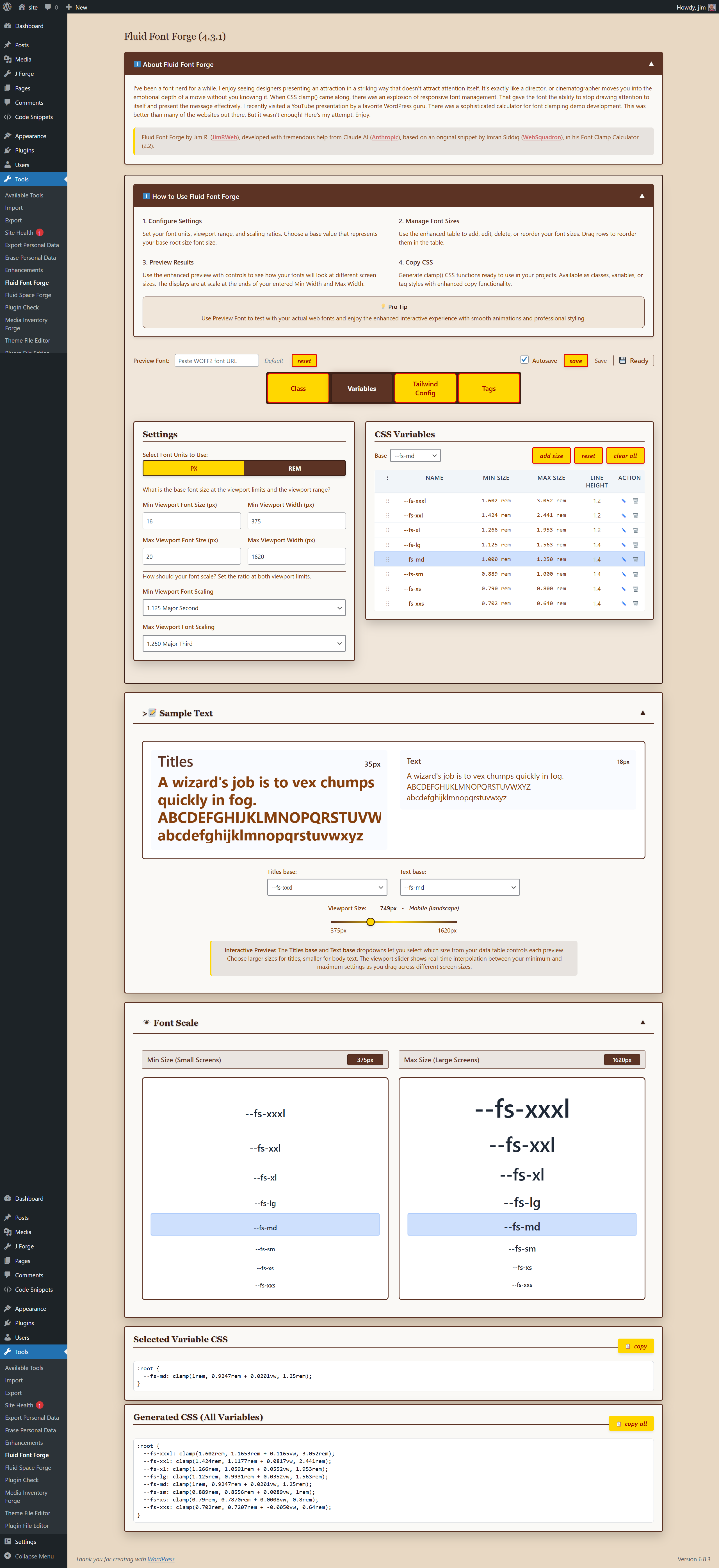
Complete Interface Overview - Manage all your fluid typography from one intuitive dashboard
Fluid Font Forge is a comprehensive WordPress plugin that simplifies responsive typography management. Generate CSS clamp() functions with mathematical precision for perfectly scaled fonts across all devices.
Key Features:
- Real-time CSS clamp() generation – See your responsive font sizes calculated instantly
- Multiple output formats – CSS classes, custom properties, HTML tags, and Tailwind config
- Interactive preview system – Visual comparison of font sizes at different viewport widths
- Mathematical scaling ratios – Based on musical harmony principles (Major Second, Perfect Fourth, Golden Ratio, etc.)
- Drag-and-drop size management – Reorder your font scale with intuitive interface
- Custom font preview – Test with your actual web fonts using WOFF2 URLs
- Copy-to-clipboard functionality – One-click CSS copying for immediate use
- Professional admin interface – Clean, modern design that integrates seamlessly with WordPress
Perfect for:
* Web designers creating responsive typography systems
* Developers implementing fluid font scaling
* Theme creators needing consistent font hierarchies
* Anyone wanting professional typography without complex CSS calculations
Technical Highlights:
* Uses CSS clamp() for true fluid scaling between viewport breakpoints
* Supports both px and rem units with automatic conversion
* Mathematical progression ensures consistent visual hierarchy
* Accessibility-compliant with WCAG guidelines for readability
* Clean, semantic CSS output ready for production use
Transform your typography workflow with Fluid Font Forge – where responsive design meets mathematical precision.
Accessibility Features:
- WCAG 2.1 compliant interface
- Keyboard navigation support
- Screen reader friendly
- High contrast mode compatible
- Minimum font size recommendations for readability
Mathematical Ratios Explained
- Minor Second (1.067): Subtle progression, ideal for dense content
- Major Second (1.125): Gentle scaling for readable body text
- Minor Third (1.200): Balanced hierarchy for most designs
- Major Third (1.250): Clear distinction between sizes
- Perfect Fourth (1.333): Strong contrast for headlines
- Golden Ratio (1.618): Dramatic scaling for hero sections