Fluid Design System for Elementor
by Artem Semkin on WordPress.org
Create fluid typography & spacing presets natively in Elementor — no CSS clamp formulas, no breakpoints, just seamless responsive design.
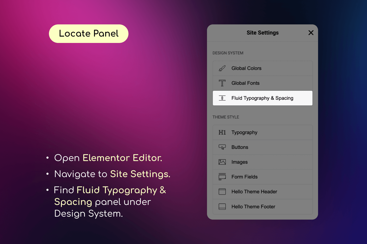
Fluid Typography & Spacing settings panel in Elementor Site Settings
Design once. Scale everywhere.
Fluid Design System for Elementor is a small yet powerful add-on that brings fluid typography and spacing presets directly into Elementor’s interface — helping you create fully responsive designs that scale naturally across every screen size, from tiny phones to ultra-wide desktops.
🎯 Think of it like color presets — but for padding, font sizes, and layout gaps.
With just a few clicks, you can:
– Define minimum and maximum values for typography or spacing.
– Apply those values using a new “fluid” unit inside any Elementor control.
– Watch your design scale smoothly—no coding or media queries required.
– Organize your presets into custom groups (e.g. “Border Radius”, “Thumbnail Sizes”) for better management.
Say goodbye to manually tweaking every breakpoint. Say hello to automatic, intelligent design scaling with organized preset management.
How It Works
❓ What Does “Fluid” Mean?
Traditionally in Elementor, you need to set separate values for each breakpoint — for example, one font size for desktop, another for tablet, and another for mobile.
While this gives some control, it has two major downsides:
– 🧩 It’s rigid: You only define styles for specific screen widths, leaving awkward gaps in between where the design may not scale smoothly.
– ⏱️ It’s time-consuming: Updating styles across multiple breakpoints for every section and element becomes a repetitive, manual process.
💡 Fluid Design System solves this.
Instead of setting fixed values for each breakpoint, you define just two—a minimum and a maximum — and the plugin automatically generates a smooth scaling behavior in between. This means:
– One preset handles all screen sizes.
– You get consistent design and spacing across the entire site.
– You save time and reduce manual effort.
– You can organize presets into groups for different projects or design systems.
This plugin introduces Fluid Units, powered by CSS clamp() and custom presets, allowing your design to scale automatically across all screen sizes.
Here’s how it works in real scenarios:
✍️ Fluid Typography Example
- Old way: 24px (mobile), 36px (tablet), 72px (desktop)
- Fluid way: One preset: min = 24px, max = 72px
- Result: Text scales smoothly and proportionally on all devices.
📦 Fluid Spacing Example
- Old way: 40px (mobile), 80px (tablet), 160px (desktop)
- Fluid way: One preset: min = 40px, max = 160px
- Result: Section padding adjusts naturally without breakpoints.
🔗 Fluid Gaps Example
- Gap between elements: 20px (mobile) to 60px (desktop)
- Result: Even spacing between containers and widgets on any screen.
❓ Why not Just Use vw or vh Units?
While viewport units like vw can scale elements based on screen width, they often lack control — your text might become unreadably small or overly large. The Fluid Design System solves this by generating clamp() values behind the scenes, so your designs stay within defined min/max boundaries. This gives you the flexibility of responsive scaling, combined with the precision of design tokens.
👉 Behind the scenes, the plugin creates CSS variables like: clamp(24px, 5vw, 72px) which Elementor then uses across typography, spacing, padding, margin, and more.
How to Use
Follow these steps to set up and use the Fluid Design System in your Elementor projects.
📐 Step 1: Configure Fluid Breakpoints
- Go to Elementor > Site Settings
- Navigate to the “Fluid Typography & Spacing” tab
- In the “Breakpoints” panel, set your:
- Minimum Screen Width (e.g., 360px for mobile)
- Maximum Screen Width (e.g., 1920px for desktop)
🧰 Step 2: Create Your Presets
- In the same “Fluid Typography & Spacing” tab:
- Go to “Typography Presets” to create fluid font size presets
- Go to “Spacing Presets” to create fluid spacing presets
- For each preset:
- Give it a descriptive name
- Set minimum and maximum values
- Optionally set custom breakpoints for this preset
🎨 Step 3: Apply Your Presets
- Edit any page with Elementor
- In any control that supports custom units (typography, spacing, etc.):
- Select “fluid” as the unit
- Choose your preset from the dropdown
- Watch your design smoothly adapt to different screen sizes
🔧 Step 4: Fine-tune Your Design
- Use the live preview to see how your presets work
- Adjust preset values if needed
- Create additional presets for different design needs
Why Use Fluid Design System?
- Perfect Responsiveness: Create websites that look flawless on every device, from mobile phones to large desktop screens including all intermediate sizes
- Design Consistency: Maintain perfect spacing and typography harmony across your entire website
- Time-Saving: Eliminate manual breakpoint adjustments with intelligent fluid scaling
- Future-Proof: Seamlessly integrates with Elementor’s latest features and updates
- User-Friendly: Manage everything through Elementor’s familiar interface – no coding or CSS knowledge required
Key Features
- Inline fluid values – Set values directly in controls (“20px ~ 100px”) without visiting Site Settings
- Save as Preset – Convert inline values into reusable presets with one click
- Create unlimited fluid typography and spacing presets with custom minimum and maximum values
- Define global breakpoints or set custom breakpoints for individual presets
- Real-time preview of changes in the Elementor editor
- Works with all Elementor widgets and elements
- Compatible with any WordPress theme including Elementor’s Hello theme
- Full support for Elementor’s responsive controls and additional breakpoints
- Mix different units (px, em, rem) in your presets for ultimate flexibility
Common Use Cases
- Fluid Typography: Create responsive headings and text that maintain perfect proportions across all devices
- Consistent Spacing: Design section padding and margins that adapt smoothly to any screen size
- Responsive Grids: Build fluid grid layouts with perfect spacing between elements
- Typography Scale: Set up a complete typography system that works flawlessly everywhere
- Container Spacing: Create fluid containers that maintain perfect proportions on all devices
- Element Gaps: Design consistent gaps between elements that scale naturally