Enable Responsive Image
by Aki Hamano on WordPress.org
WordPress plugin that adds settings to the Image block to display different images depending on the width of the screen.
(5)
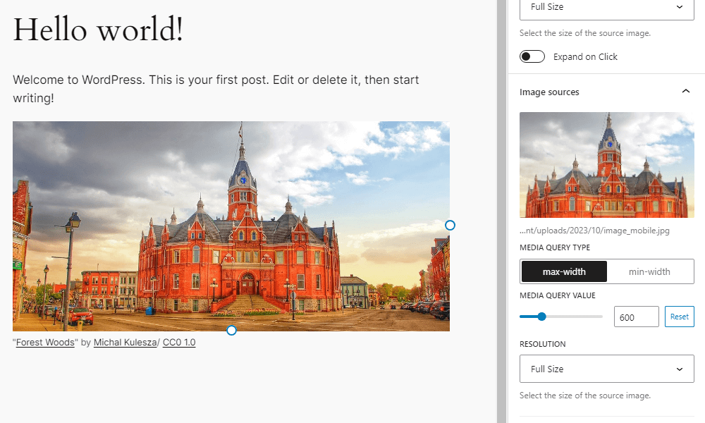
Settings added to the block sidebar of the image block
Enable Responsive Image adds settings to the Image block to display different images depending on the width of the screen. You can add multiple images and set media queries and resolution for each image. If the screen width matches the conditions of that media query, it will switch to the corresponding image.
Resources
Image for screenshot
- License: Public Domain
- Source: https://openverse.org/image/cd8e5cc5-d38a-462e-b4c1-1ea5c6f94e20
Active installations1K+
Weekly downloads
224+46.41%
Version1.6.0
Last updated3/3/2026
WordPress version6.9
Tested up to7.0
PHP version8.0
Tags
blockgutenbergimageresponsive